Swati Gupta’s office design for Raysil expertly merges century-old architecture with modern aesthetics, embodying innovation and legacy.
Raysil, a fashion yarn business of Century Rayon located at Churchgate, Mumbai, stands as a testament to innovation and legacy. It exemplifies the intersection of tradition and modernity, serving as a hub for creativity, collaboration and excellence, reflecting the ethos of Century Rayon. This office spread over 10,000 sq ft is designed by Swati Gupta, Founder & Principal Designer of Bluedot Design. For this office the objective was to craft a dynamic and contemporary design concept, resonating with the essence of the brand. Embracing the historical significance of the building, the design seamlessly integrates existing elements, blending them with modern aesthetics to honour the brand’s identity while revitalizing the space.
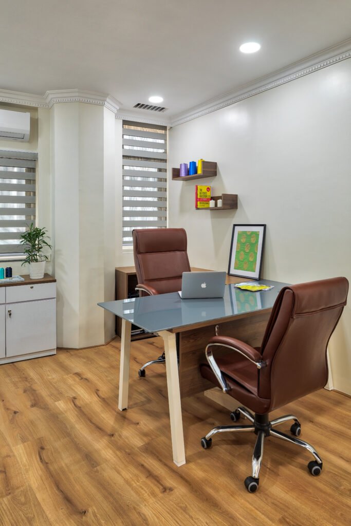
Situated within a century-old historical building in Churchgate, this office was a relic of Century Rayon’s legacy. Preserving its external elements, like doors and windows, was imperative, permitting only refurbishment and repair for maintenance. Explaining the design process in detail Swati Gupta, Founder & Principal Designer of Bluedot Design, says ”Despite its dated appearance, we meticulously modernised it to meet present needs, balancing preservation with contemporary functionality, all within budget constraints. Another challenge we encountered involved low beams, limiting the available height, and the client’s preference against an open ceiling plan. Despite these constraints, we needed to create an illusion of spaciousness within the space.”
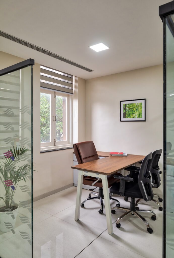
The office spans over two floors, each serving distinct purposes. The lower floor was to accommodate senior managers and a meeting place for vendors with a studio space showcasing their products, with areas designed to balance privacy and collaboration as per the client’s specifications. Meanwhile, the upper floor caters to senior management, featuring private cabins. Throughout, a contemporary, dynamic aesthetic prevails, reflecting the brand’s youthful accessibility and vibrancy, creating spaces to showcase its identity.
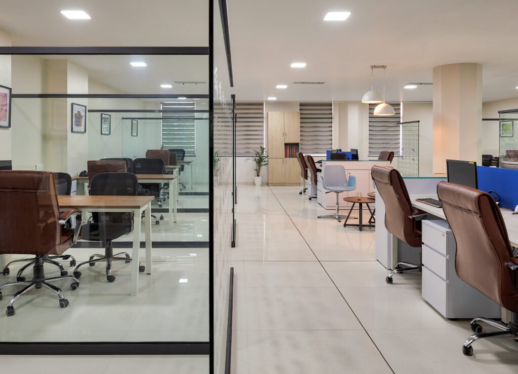
To optimize the layout of the office space for functionality and efficiency, the team conducted a thorough analysis of workflow patterns and employee needs. They strategically positioned workstations on both sides of the layout and kept the meeting areas, centrally located to minimize travel distances and encourage collaboration. Additionally, the team implemented flexible furniture arrangements in the breakout areas to accommodate varying tasks. Integration of ergonomic principles and ample natural light further enhanced productivity. Regular feedback and iterative adjustments ensured continual optimization of the workspace.

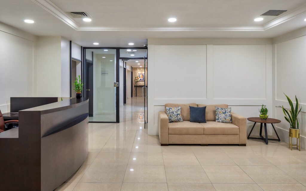
The entrance lobby and reception area serve a variety of functions, including a lift lobby adorned with green landscaping and a lively reception area featuring sustainable cement tiles on the main wall, accentuated with warm lighting to create an earthy ambiance that highlights the company logo. This wall serves as the backdrop for a sizable reception table, while adjacent to it is a studio designed for showcasing Raysil products and facilitating vendor discussions. The Studio area adjacent to the reception is pivotal in shaping guests’ first impressions of the business space, offering a prime opportunity to exude a welcoming atmosphere that reflects the organization’s ethos. This space presented a significant opportunity to enhance visual appeal for guests, as the original setup consisted merely of a plain wall with limited engagement opportunities.
In one corner, colour pop was added with the seating furniture which is complemented by a console displaying artefacts, adding vibrancy to the space. Furthermore, the inclusion of colourful century rayon yarns and Raysil garment prints as wall frames serves as inviting accents, effectively showcasing aspects of the business. Concealed behind one side of the reception area are storage and toilet facilities, which were camouflaged by adorning them with a Raysil garment image stretched across the entire storage, creating the illusion of a larger wall space.

Revamping this area was particularly enjoyable, as it involved creating a more transparent and inviting ambiance, thereby expanding the perceived openness of the reception. The conventional wall was replaced with an appealing metal partition showcasing colourful garments and fashion yarns. Comfortable seating areas were introduced to encourage interaction between clients and vendors, complemented by accent pillows. To infuse warmth into the space, wooden flooring was introduced in the studio, creating a striking contrast with the rest of the floor. The metal display rack acts as a subtle divider between the reception and work areas without obstructing the view, resulting in a transformation of the reception area into a more hospitable environment that leaves a positive first impression.

Explaining the unique spatial features Swati Gupta adds, “We introduced cabins on the curvilinear side of the office space. This curvilinear design helped us break away from traditional linear layouts, offering a more fluid and dynamic spatial experience. Keeping the cabins on the external side we were able to optimize the corner spaces without letting any space go to waste. This also helped to create a sense of movement and flow within the space, enhancing visual interest and stimulating creativity, keeping the breakout, business centre and secretarial pool in the center, opening up the space. Moreover, all partitions in glass, which helped bring in natural light, were much needed in that space which was initially very dark. This also helped us optimize circulation paths and foster natural interaction among employees, promoting collaboration and idea exchange. Additionally, the curvilinear design adds a modern and sophisticated aesthetic to the office environment, aligning with the client’s desire for a vibrant and contemporary workspace.

The conventional solid cubicles were replaced with open glass cubicles positioned along the periphery. This transformation shifted away from a dense and enclosed workspace towards an open floor plan. Despite maintaining individual workstations for employees, the new design facilitates easier collaboration with colleagues when necessary. The revamped space now exudes openness and inclusivity rather than confinement and isolation. Privacy was augmented with the addition of yellow and blue dividers, injecting vibrant splashes of colour.
Moreover, open breakout and discussion areas were introduced to provide employees with opportunities for brief respites or informal meetings. Storage units were strategically incorporated without overwhelming the space, ensuring functionality without sacrificing aesthetics. Bare walls were adorned with a large vinyl graphic depicting fashion on one side, while the remaining walls were embellished with frames narrating the story of the yarn business’s evolution.
Individual offices play a pivotal role in enhancing productivity and fostering a positive workplace environment. Thoughtfully designed offices contribute to employees’ enjoyment of their work and increase productivity levels. The existing executive cabins were overdue for an update. While functional, they appeared cramped due to oversized furniture and lacked vibrancy.
To create a more spacious feel, furniture was streamlined with ergonomic chairs and sleek, minimalist tables. Within these cabins, small relaxation and meeting spaces were integrated, featuring modern lounge chairs. Removing solid partitions and replacing them with floor-to-ceiling glass partitions enhanced privacy while maintaining an open atmosphere, allowing occupants to feel connected to the larger workspace. Vibrant artwork and frames displaying Raysil fabrics added splashes of colour, enhancing the overall ambiance of the working areas.
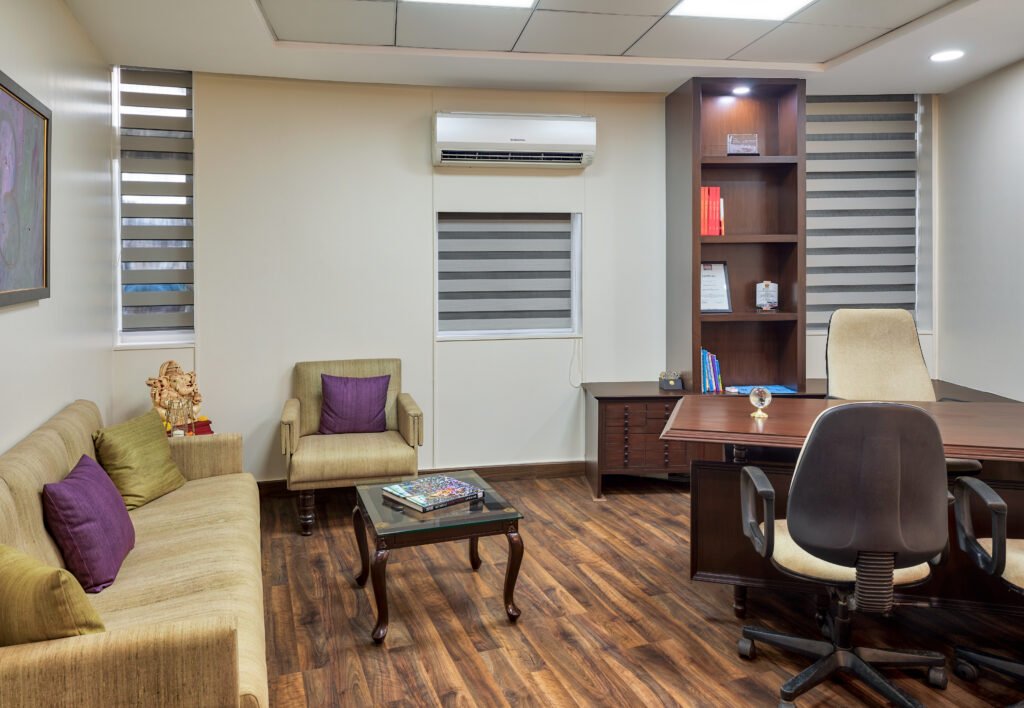
Regarding the upper floor cabins, the CEO’s suite needed to exude a welcoming atmosphere conducive to conversations. The previously dark and uninspiring appearance did not align with the vibrant image of a company specializing in colourful yarn. Therefore, a remodel was necessary to better reflect Century Rayon’s vibe.
The transformation is evident in the newly refreshed space, which now feels more welcoming and vibrant. Replacing the carpet with wood flooring introduced a natural and elegant touch, complemented by tables matching the flooring and new comfortable seating. Accentuating the space with purple pillows, echoing hues found in the original artwork, added subtle pops of color. One notable feature desired in this area was a beautiful photo of the company’s founders, which, while significant, was not given due prominence. This was rectified by strategically placing a console table, planters, and a tall lamp to frame the photograph, turning it into a focal point. Moreover, the console provided space for displaying other decor and personal photos of the CEO, filling previously empty areas and drawing attention to the cherished photograph.
Photographer: Pulkit Sehgal, Styling: Rohan Anand


