Opting for new materials and modern user-friendly designs, Milind Pai Architects designed a functionally-efficient office for Sapana Polyweave Pvt. Ltd., in Mumbai.
“Good design seeks a wholesome solution to a strategic environment” asserts Ar. Milind Pai. Milind’s primary focus always remains on creativity, business psychology and asserting design thinking at the core of everything he does. This has been his operative discipline and work methodology right from the inception of his firm. Sapana Polyweave Pvt. Ltd., is an office for a company that produces premium polypropylene mat material and is located in the business district of Goregaon, in Mumbai. The 2,800 sq. ft. floor plate of this office covers the Reception Area, Conference Rooms, Workstations Space, Cubicles, Smaller Cabins Director’s Cabins and a Pantry.

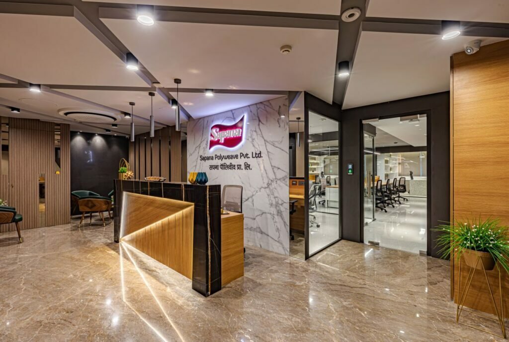
This project has a dominance of concrete texture with wood and the colour grey is predominant in the entire space, as per the client’s brief. To explain the design concept further Milind adds, “The overall theme of this space is very subtle and rustic as bright colours were not of our client’s taste. And the charm of the space has been maintained by paying precise attention to the sourcing of all accessories and artefacts. This office had an open working concept in mind, so none of the glass partitions have any film or opaque theme on them, not even for the Main Cabins.” The Reception Area of this space has a bold and elegant look and feel, leaving a permanent impact as one enters the office space. The table is custommade, crafted with a combination of deep brown marble and light wooden finish laminate with metal strips interspaced. The indirect light from inside the table, washing the laminates, elevates the grains and wooden texture. The back wall of the reception is cladded in Satvario marble, with mirror strips on both ends. The company name is illuminated in the centre of the backdrop behind the reception.

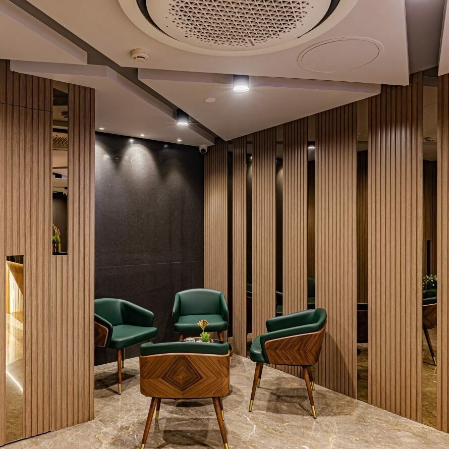
Towards the left we have a waiting lounge for this office, which has been segregated by the light wooden finished fluting and mirror panelling, making the space look visually separate, yet composed. The ceiling for this space has been designed with triangular and trapezium blocks with white ones dropping down and the grey ones recessed inside, making the ceiling a distinct highlighted element. All the doors and frames of this space have been highlighted in dark grey colour, leading to various spaces like meeting rooms, workstations, cabins and pantry. The location of this Reception is such that it divides the office into two segments, one being the working space and formal section, like the main cabins, conference space, workstations, and smaller cabins and the other being the visitors, meetings and pantry segment for casual or visitor meetings and breakout lunch section. A Meeting Room is created next to the reception for small meetings with visitors that need not enter the main office space. A stone-finished dark grey laminate is used for the walls of this room.
Further entering the working zone, we see the Small Cabins in line, on the right side of the space. The wall in the backdrop of these cabins is finished in brown, WPC louvred panels with rectangular lights suspended through the ceiling. A stone-finished dark grey laminate is used on the walls of all the small cabins and meeting rooms, throughout this office. All the office furniture is modular and sourced from a well-established Indian brand, and the flooring in this segment is done in terrazzo stone tiles.

Coming to the Conference Room, the walls are panelled with a light grey, stone laminate and the TV unit has a light brown laminate with horizontal veins. The conference table top is a customized piece which has a thick white terrazzo stone top, which portrays an exclusive element and gives a feel of elegant uniformity to the space. The legs of this table have been kept thick, to hold the heavy stone top appropriately. For lighting, we have a square light formation suspended over the conference table, with a grey body that coordinates well with the walls and chairs.

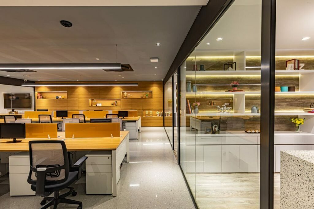
The Workstations have been kept white, with a wooden top, while a bright orange shade is used for the back-painted glass desk partitions. The wall behind the workstation has been used as a storage space, as adequate storage was one of the main design requirements of the client. With some open niches for display, the unit is finished in veneer-finished laminate, adding a warm tone to the space and giving a clean and uncluttered look to this space. The design of this space is a combination of various rustic and polished finishes and textures which creates a unique aesthetic appeal and is enhanced with a mix of bright hues in the predominant brown, grey and white theme.

As you advance further, you see the two main cabins of the office, which have been designed on similar lines. As mentioned earlier, the partitioning glass between the workstation and cabins is completely transparent, adhering to an open office concept. Both cabins have been given light wooden flooring tiles, and both tables have been custom-made with white terrazzo stone. The storage behind the tables is finished in matte white laminate, enclosed in the bottom and has open shelves of various lengths above, with a back-lit stone finish grey laminate behind, as the directors were keen on displaying several handpicked artefacts and trophies in their cabins. Grey blinds are used on all windows throughout this office.
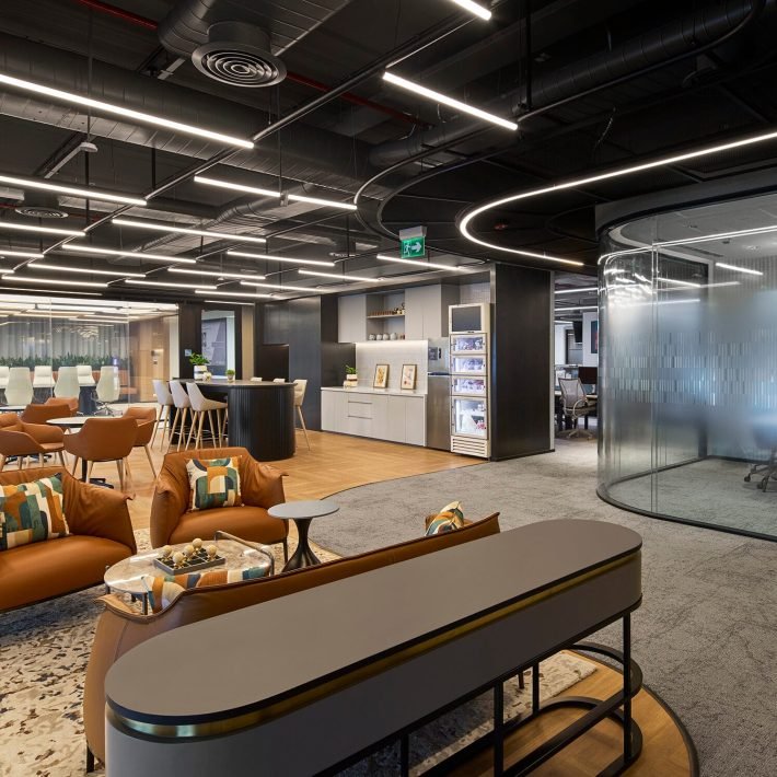
The Pantry is a remarkably versatile space in all its glory, following a contemporary approach. This space design is a combination of various materials, finishes and textures which create an aesthetic appeal to the space while the hues of grey keep it tasteful. As you enter, your attention directly diverts towards a brick pattern on the wall, giving this contemporary space a visually rustic look. On our right, we have a white terrazzo counter basin, with a mirror and fine WPC louvres, and a sleek, fancy light. The Pantry has both a low-table seating setting, with low chairs and a high-counter seating setting with higher chairs. The turquoise chairs add a cheerful vibe to this space. This space was designed in bright colours to bring a vibrancy of sorts to the breakout zone.
The overall interiors of this office are aesthetically appealing and alluring to enhance the working environment. A lot of effort has also been put into equipment and gadgets to match the design input for which MPA believes to work closely with the other consultants. The ambience and the facilities are extremely attractive and functional for the employees.
With every job, Ar. Milind Pai and his team strive to make a positive contribution to the way of thinking and comprehensively produce outstanding spaces.


