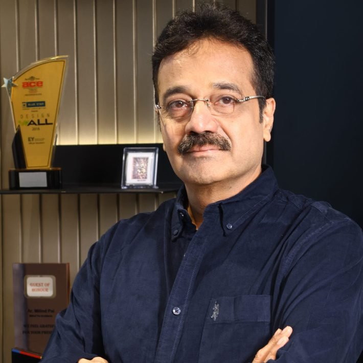
Ar. Shobhan Kothari and Anand Menon have designed a home that is a fusion of functionality, understated elegance, and dramatic flair.
Art Haus spread over an area of 3,000 sq ft is designed for a client who wanted to have a second home in Mumbai away from his hometown. The client purchased the space during the pandemic when most people were investing in a second home. Armed with a brief to design a multi-purpose home that would double up as a business house and also retreat, talented architects Ar. Shobhan Kothari and Anand Menon co-founders of ADND have excelled in creating this multi-purpose space.

The client is an ardent collector of art; so the designers focused the theme around the art, rather than creating a detailed kind of shell. Interestingly, the house already had a structure of four bedrooms and bathrooms, so no spatial planning was required. The client needed all four bedrooms – one for his parents, two for his children (son and daughter each), and one for himself.

“The house inherits a long corridor from the main entrance door and is disconnected from the main living room and dining space. These are anomalies or challenges of the high rises that are coming up in Mumbai,” explains Anand Menon, Co-Founder ADND.

When you enter this home, you arrive at this long corridor. The idea was to enhance this long walk because it was a passage, and there was no heavy requirement of storage, being a second home. An idea of a log of wood, driftwood, was explored, which was integrated with interesting seats that were custom designed in wood logs. They were adorned with a cabinet at the end which engages with this wood. It allowed having a grazing wall onto which an Infinity art was put up, made by artist SevalRaj. The wall opposite the bench is adorned by artist Sebastian George. Between these two arts is the parents’ room.

When you enter the parents’ bedroom, there is a cosy arrangement of lounge seating as soon as you enter. The other side of the bedroom has a bed and a side table, and a TV entertainment unit. The design here is held together by a very long extended headboard, which is taken up to a waist-level height. It holds both the lounge area as well as the bed. Above that, at equal extremities of the headboard, is interesting wallpaper, which is the main highlight of this room.
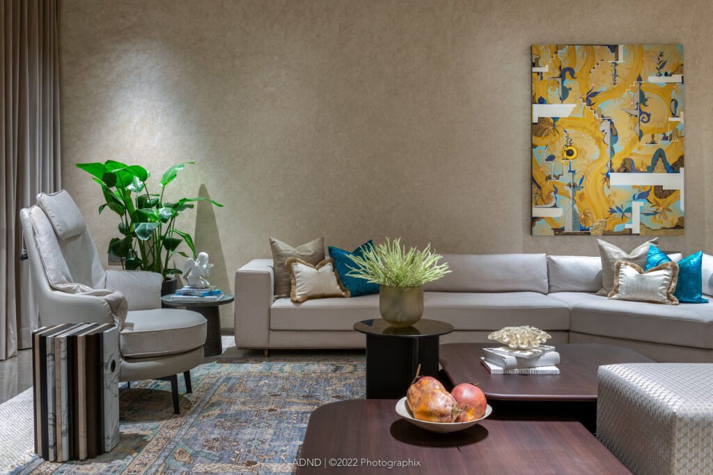
From the corridor, straight ahead, is a spacious living and dining space. What is intriguing is that from the entrance corridor, you get a glimpse of a large wooden installation on the wall by Martand Khosla. On the left, when you turn, you see a large dining table, opposite, which is an interesting artwork, Thukral & Tagra.

The backdrop of the dining area is exotic marble console with storage and above that are fluted glass cabinets which become display cabinet cum storage. “The reason for taking this particular style of designing of flutes on the shutters was the fact that on one side, it forms a pantry cabinet and the storage, and the other end of the flutes turns to form a U-shape – the vertical of the pantry, the horizontal of the console, and then again vertical, where the column is camouflaged. Adjacent to the column is the entry into the son’s bedroom. The flute not only holds the corridor and the corner together but it also helps to camouflage the massive column.” says Shobhan Kothari, Co-Founder, ADND

The living room has been looked at as a social gathering space. It has been kept devoid of traditional television or entertainment units, due to the fact that it is a second home and is looked at as purely a space for entertaining and relaxing. The corner engages with the bar, above which is an artwork. In the living room there is the Jagannath Panda artwork. The living room has an attached balcony which overlooks the sea link.
Between the living room and console there is a small passageway, where, tucked in is the powder toilet behind the living room. On the right is the son’s room, the first in the line. The design plays along the lines of youngster and masculinity. There is a play of black and white stripes and a bold Moroso sofa is kept in the corner with an orange pop-colored table. The bed is held together with the Dalmata Italian marble as the backdrop. On either side of it there is the storage cabinet.

In all the rooms, the wardrobe space is not in front of the sleeping area. They are tucked away and are planned in a way that is in front of the bathrooms and not in front of the bedrooms and the lounges. Again, in the son’s room, there is a corner which turns delicately with a set of 6-7 paintings.

Outside the son’s room is the daughter’s room. The daughter is extremely young, so to provide a feminine touch, the colours are chosen more on pastel shades. The headboard is rounded fluting with soft padding which is provided over the independent headboard of the bed. The lights that are chosen are extremely delicate in nature and look like earrings and pendants, in which one is a table lamp and the other is a hanging light. The design of the dresser is taken from the idea of a travelling trunk, which is a trunk kept on a trunk.
The master bedroom, which is at the end of the apartment, opens up into a lovely space in the middle where there is the wardrobe facility leading to a diwan area, a sitting area in the bedroom, with expansive views on two sides and an L-shape format. Here, there is a cantilevered marble study juxtaposed with a LCD unit in wood which forms one side of the wall.

One admires the colour palette, the shell was kept extremely neutral, because of the client’s heavy investment in art. Being an art collector, the owner’s collection has been aesthetically displayed around the residence. Art has its own array of colours the designers needed to create a neutral backdrop to display the art collection. Besides being explored in different materials and each artist has his own bias toward his medium, their colours have also shined through their respective arts. So it was more about picking the artwork for the walls rather than the colour of the house. Even the furniture had to have the shades and tones which would complement those works.

The entire house showcases ADND’s expertise in designing unique spaces. Every corner and edge of the house reflects two sentiments, keeping it functional and crisp, and no-nonsense in a manner so as to create a sense of understated elegance and drama.
Photographs: Photographix
Material Box:
Sanitary ware/Fittings: FCML
Furnishing: Sakshi Pathak
Furniture: Bonaldo, Flexform, Mezzo Collection, Moroso
Lighting: Flos, Vibia, Oluce, Bomma
ACP/Glass/Concrete: Delta Contracts
Flooring: Delta contracts
Air Conditioning: Delta Contracts
Kitchen: Vittaazio
Paint: Delta contracts and Magic


