Kumpal Vaid, Founder & Principal Designer, Purple Backyard, gushes over white interiors in time for the festive season!
White is unobtrusive, calming and the beginning of all colours. It reflects and scatters all visible light. Because it is without hue, white is neutral and can be paired with a wide range of colours. That itself says so much about the versatility of this colour.
Power of white
White is an exceptionally powerful colour, both psychologically and culturally. It is inherently soothing and is associated with innocence, light, mindfulness, safety, brilliance, illumination, understanding, cleanliness, beginnings, spirituality, possibility, humility, softness and perfection.

Versatility rules
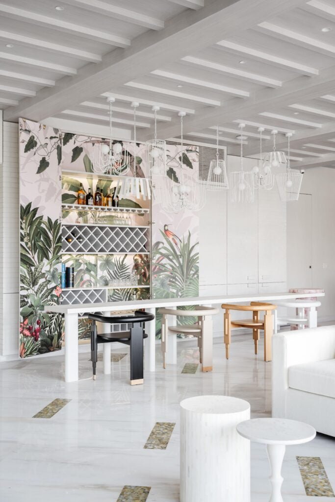
White gives you the freedom to layer textures and colours as you desire. So, if you love colour, you’ll have more opportunities to bring it into your space once you fully embrace the magic of white. The wonderful thing about white is that it goes with every colour. It is this versatility that makes it a great choice for festive occasions. Bright colours and décor dominate our interiors during the festive season, but white balances them out. This can be achieved through accents, soft furnishings or décor in white complemented with other festive decorations.
The bright choice
White is great for dark spaces as it brings a sense of lightness. Even when used as an accent colour to a dark theme, it instantly lifts a space. It can do wonders for brightening up a dull space. For example, if you have a dark room that you want to lighten up; wool-white paint, wallpaper in simple prints or a tone-on-tone effect and textured paint could be possible solutions. If you have a lot of dark furniture, cotton/wool-white walls can help to balance it out. If you can’t stand the “off” or yellowed white looks, cool-toned white paint is the perfect colour to complement a modern or contemporary aesthetic.
Tying things together
White can be used as a complementary, secondary or primary colour. It fits into any design without throwing any tantrums. When using 10 different textures or shades in a space, a whitewash in tones of white like milk, cotton, wool, egg, or lace white can create a brilliant effect without dulling any texture or shade. Even beige to light cold coffee tones work well together when used for complementing textures. Hence, white creates a focal point but harmoniously brings the space together.
Pairing off
When paired together, black and white create high contrast and striking results. If you look back at most heritage structures, you’ll find beautiful floor patterns in black and white. Similar contrasts can be found in the murals in the Shekhawati region of Rajasthan. Artists and designers in every era have adopted this dramatic combination.
Teaming white with grey creates a monochromatic scheme that is subtle, chic and easily adaptable. White is chic, but when used too liberally, it can feel harsh and clinical. For liveable narratives, white is used with natural colours and materials to offset its cleanliness. Wood, copper, blue and rust colours give white interiors a cosy, Scandinavian-inspired look.
Always in style
White can represent nothingness and possibility. It can also be a signifier of good taste, sophistication and simplicity. Brands like Jo Malone have placed white at the core of their aesthetic and ethos.
White rooms can be boring or dingy, if you choose a white that isn’t the right shade, don’t have enough lighting in the room, or accessorise poorly. But if you choose the right white and add some easy touches, it can be the focal point of a home! When faced with the challenge of decorating a compact space, homeowners turn to white for the wall colour – with good reason. White makes a room feel more spacious and maximizes light. White walls are classic and can never go out of style.
The lived-in feel
White is a very liveable colour. It’s easily repainted, washed or bleached, and is not as delicate as people think. I never understood the concept of not using white because ‘it gets dirty.’ If you love it, use it! Let it wear and live a little. White bricks get better over time as they start to fade. Even white wood floors attain a certain aesthetic as the paint wears off. Once you get past that first oh-so-painful spill or mark on it, you realise it’s going to be lived-in and is meant to be enjoyed. Also, you can always bleach the white fabrics to make them as good as new.
A magical touch
Painting a space white makes you notice the texture, the brick, the wood, the room and all its elements. It makes you notice the light coming in through the windows, the art, the furniture, and the people in the space. It’s pretty magical. White has more power and more importance than you realise, and might just be the perfect way to light up your home during the festive season. It is an exceptionally powerful colour, both psychologically and culturally. The wonderful thing about white is that it goes with every colour. It is this versatility that makes it a great choice for festive occasions and can represent nothingness and possibility. It can also be a signifier of good taste, sophistication and simplicity. To sum it all up, white is a very livable colour. It’s easily repainted, washed or bleached, and is not as delicate as people think.

")

")