In 2026, colour is no longer just decoration—it’s a language. It shapes how we feel, interacts with our environment, and responds to the way we live. Interiors are moving beyond fleeting trends, favouring palettes that are psychologically intelligent, material-sensitive, and timeless. Designers have become ‘colour strategists,’ curating schemes that support wellbeing, enhance functionality, and tell stories that endure.
This year, colour is about emotion, earth, and expression—a balance of serenity and vibrancy, of natural authenticity and bold statements. It’s about crafting spaces that feel alive, grounded, and meaningful.
Emotion in Colour: Serenity Meets Expression
The emotional power of colour is at the heart of 2026. Whites, soft neutrals, and muted chromatics create calm, restorative spaces, while strategic pops of vibrant tones energize and inspire.
• Serene whites: Pantone Cloud Dancer offers a whisper of tranquillity and a fresh start.
• Soft neutrals: Cloud whites, chalky greys, and warm ivories foster mental clarity and comfort.
• Muted chromatics: Dusty blues, olive greens, and softened terracotta add warmth without overstimulation.
• Vibrant accents: Burgundy, coral, muskmelon orange, and canary yellow inject energy and optimism.
“Soft neutrals act as emotional anchors—promoting mental clarity and visual rest in a noisy world,” says Design Studio Insights. These colours are perfect for bedrooms, living spaces, healthcare environments, and offices—anywhere calm and focus are needed. Think sunlit walls, linen textures, woven baskets, and greenery creating quiet, restorative sanctuaries.
Function-Led Colour: Light, Material & Tone
Colour in 2026 is dynamic, responsive, and deeply tied to materiality. Palettes shift with light, material, and time, creating adaptive spaces that evolve throughout the day. “Colours are chosen for how they shift with light, material, and time—creating a living palette that adapts,” notes Modern Design Trends.
Key approaches:
• Neutral anchors: Mineral greys and soft charcoals.
• Calming backdrops: Desaturated blues and greens inspired by ocean depths and moss-covered stones.
• Material influence: Lime plaster, terrazzo, brushed aluminium, and recycled composites shape perception and mood.
These considerations enhance spatial clarity, light responsiveness, and durability, ensuring interiors function as beautifully as they look.
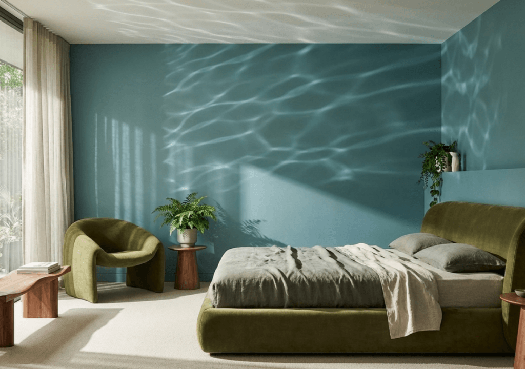
Nature in Motion: Transformative Teals & Greens
• Biophilic design evolves in 2026, with abstract, nature-inspired colours that evoke calm and renewal.
• Transformative teal: A fusion of blue and aquatic green, symbolising change and redirection.
• Moss & eucalyptus greens: Foster tranquillity and mental balance.
• Mineral hues: Chalk, limestone, weathered sand, and atmospheric blues add authenticity and depth. “Natural colours reduce stress, improve focus, and provide a psychological retreat,” explains WGSN. Visualise teal accent walls reflecting sunlight, moss-green furniture, and artworks inspired by textures found in forests, rivers, and skies—a bridge between indoor spaces and the restorative power of nature.
Longevity & Cultural Roots: Timeless Earth Tones
• 2026 values palettes that endure. Earth tones evoke warmth, authenticity, and a connection to tradition:
• Burgundy, burnt clay, forest green, deep browns.
• Ochre, rust, cocoa—rich, tactile, and timeless.
“Earthy palettes evoke warmth, authenticity, and a grounded yet adventurous spirit,” observes Heritage Design Collective.
These shades age gracefully and adapt beautifully over time, creating interiors that feel deeply rooted and enduringly authentic. Terracotta walls, textured clay finishes, deep green furniture, and layered natural-fibre textiles are all hallmarks of this grounded, long-lasting approach.
Quiet Luxury & Subtle Depth
• Bold colours still make statements, but 2026 favours subtle sophistication—spaces layered with tone, texture, and material rather than drama.
• Deep burgundy, smoky mauves, charcoal, and indigo offer quiet richness.
• Layered finishes of plaster, stone, timber, and metals create depth and intrigue.
“Depth without drama—spaces that evoke richness through subtle variations and materiality,” notes Luxe Living Insights. Soft lighting, textured walls, and natural materials give interiors a confident, refined, and enduring character—perfect for intimate corners, statement features, or contemplative zones.
Colour as a Human-Centric Tool
In 2026, colour transcends surface aesthetics. It is strategic, human-centric, and functional. Designers are now crafting colour ecosystems—base hues layered with complementary tones and material accents—creating spaces that are calm, authentic, and enduring.
“Designers are now creating colour ecosystems—base hues supported by layered tones and material accents—resulting in calmer, more authentic spaces,” observes Future Interior Trends.
From emotional well-being to spatial clarity, from natural resonance to timeless appeal, the colour palettes of 2026 are about designing interiors for the heart, mind, and soul—spaces that feel alive, intentional, and profoundly human.
(Kanika Bawa, Founder of Kanika Bawa Design, is a 3-time LIMCA World Record holder in design installation with 22+ years of experience in interior and retail design, known for Indian Contemporary aesthetics, iconic media sets, design education, trend forecasting, and impactful social initiatives.)