Designed by House of Hues, this modular workspace in Worli, Mumbai is infused with a sense of minimalism with a burst of vibrancy.
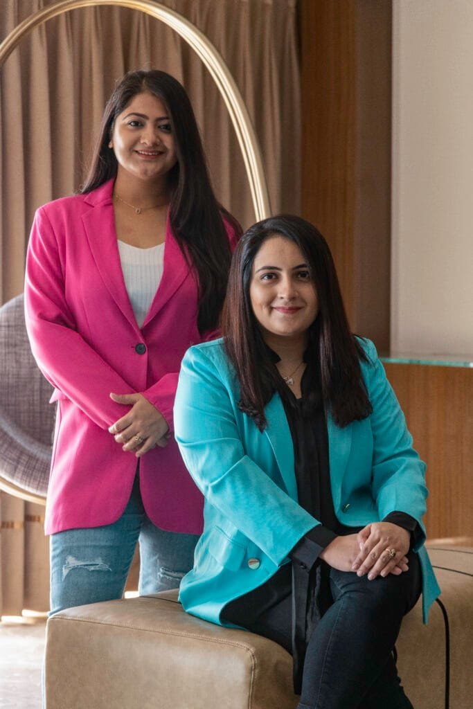
The innovative and vibrant Worli Office designed by House of Hues, blends minimalist aesthetics with modern flair, crafting a contemporary and highly functional space. House of Hues is a distinguished interior design studio based in Mumbai, founded in 2020 by Principal Designers and Co-founders, Vijal Parmani and Dhwani Kanani. Specializing in a comprehensive ‘design + build’ approach, they handle a diverse array of projects including offices, apartments, bungalows, restaurants, cafes, and beyond—regardless of scale or budget.
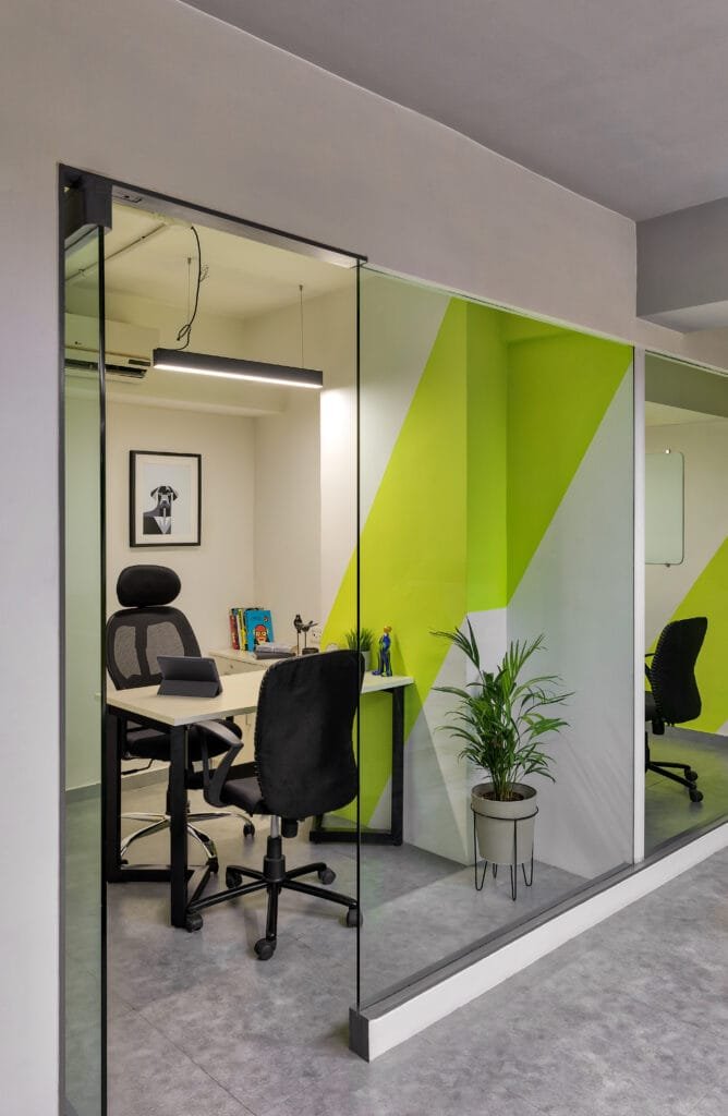
The client operates in the realm of creative communication and technology. Their brief was straightforward yet unique: as they were relocating to a rented space, from another rented space all elements needed to be modular and reusable. Explaining the clients brief, Vijal Parmani, says, “The underlying theme of the space that spreads across an area of 2200, sq. ft. was vibrancy since the company is into the creative industry and majority of their employees are from a younger generation. The play of colour and design in each room lends it its own identity. The base palette of neutral concrete flooring with pops of vibrant colours along with white without overdoing any one colour makes the place look complete. Colours, patterns, graphics, play a key role in the design of the entire space.”

The brand’s ideology aligns with the idea of creating a good first impression, and the designers have applied the same to the entry and reception area of the office. For the entrance, the team decided to give a pop of blue on the door, with another pop of yellow on the reception back drop wall, creating a nice vibrant aura. The clients were keen on having their logo to be placed on the reception wall and wanted to display their accolades and achievements somewhere near the reception. “In the reception area, we gave a pop of yellow as it symbolises happiness and energy, also it compliments their logo colour. The logo has been made in MDF CNC cutting and we have done PU on the MDF with a back light to achieve the look and to highlight the wall”, informs Dhwani Kanani. The ceiling and flooring maintain a grey palette in order to highlight the pop of colours in the space.

As ones comes ahead from the reception area, they enter into waiting area or the informal meeting room. The space is a continuation of the pop of striped yellow colour into the room, allowing the area to blend into each another. Vijal informs, “Along with yellow we decided to go for blue sofa to add a vibrant colour in the space. The left wall has been highlighted by displaying logos and the names of big companies with whom the client has worked with.”
Moving ahead into the passage there is an entry blue door for washroom, thus maintaining the colour theme in the space. Since colour, patterns and graphics play a dominant role into design of this space, the team decided to add a fun element with the fire extinguisher, treating it as an oxygen cylinder on the back of a man who went in for scuba diving. Keeping rest of the walls plain white, the team has tried to lend this space a brighter look by allowing the natural light to come in. The quirky washroom area features monochrome tiles till half height while the rest of the walls have been painted yellow.

Dhwani further adds, “Moving ahead in the main office area, we wanted to give different type of seating in the space. As we enter first we see is high seating areas with a colour play of white and yellow on the walls in the form of vertical stripes and on the high back stools. On the walls we have added fun quotes with different Bollywood characters and colour into the frame adding up a fun element into the space.” Vijal adds, “Right behind the high seating area there was a corner notch, we decided to give a normal bench seating, transforming that corner as an informal discussion area. The space features a quirk of French lime green colour on the walls and the ceiling and for the upholstery material. For the COO’s cabin, we have tried to create a playful element through the continuation of stripes in French green colour.
Embracing a quirky aesthetic, the team has used bold colours to energize the conference room. They chose a striking Chelsea blue colour for the walls, floor and ceiling making it appear like a blue vibrant room with sleek glass partitions. “Along with the blue, we have given a striking contrast by making use of yellow for the chairs. While the lightings have been added in a pattern to create a playful element in the space”, informs Vijal
The existing space of the workstation area was characterized by a stifling, enclosed atmosphere, featuring traditional office cubicles that starkly contrasted with the client’s vision for an open, airy environment. The low ceiling concealed all services, contributing to a claustrophobic feel. “From the moment we assessed the space, we decided to overhaul it, aiming to create a more liberated and expansive atmosphere. Our vibrant and quirky theme follows in the workstation area ceiling and flooring continues to be grey, with profile light installation in different shapes and patterns. Workstation top being pine wood and back painted glass we opted for pop of colour in yellow, in order to maintain a balance, by merging yellow and grey”, adds, Dhwani.
The workstation also had a play zone which is a common area where people in the office can take a break and chill out. The incorporation of jhulla here lends the space an informal setting, alongside the addition of PVC grass differentiates the play zone area from the rest.

Beyond catering to the diverse and curious eyes of onlookers, the space transparently communicates the identity of the designer duo. Departing from conventional design trends, this office sets its own standards of inspiration, celebrating vibrant and refined elegance in a manner uniquely its own.
Photograph Courtesy: Pulkit Seghal


